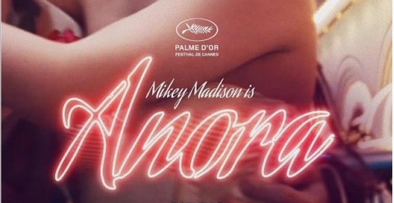
The Best-Picture Oscar winner Sean Baker uses the same curvy type-face for logo-treatment for all his movies: the flowery, handwriting-like Aguafina Script, which graces his “Anora” (pictured above). A Fast Company magazine article notes top filmmakers tend to use the same typefaces for multiple movies, which is a subtle branding exercise.
“Wes Anderson has an obsession with Futura, while John Carpenter set his film credits in Albertus, a formal serif,” writes Hunter Schwarz in Fast Company. “Papyrus is now synonymous with James Cameron’s ‘Avatar’ franchise, and more than 40 of Woody Allen’s films use Windsor.” In typefaces, serifs are the decorative strokes often found on letter and numbers.
Films and other entertainment are generally not suited for brand-like images. Consumers have no idea what company is behind films or music.
But arty filmmakers have personal followings among cinephiles, as is the case for Baker. He just won four Oscars, including Best Picture, for his comedy-drama “Anora” at the Academy Awards.
Consistent type fonts connect multiple films and consumers will recognize the filmmaker’s future projects with the same typefaces. The associations may be subtle and subliminal but are a brand-like signature.
Hollywood uses off-the-shelf fonts, but since there are so many floating around publishing most are distinctive.
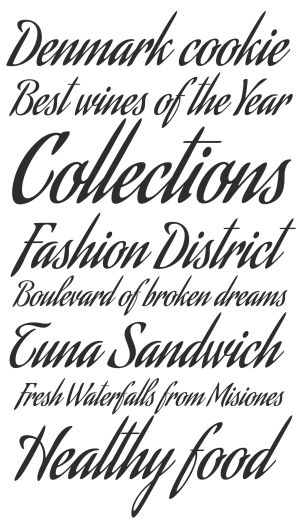
“Created by type designers Alejandro Paul and Angel Koziupa of the Argentinean type foundry Sudtipos, Aguafina Script is described as ‘semi-formal and eye-catching’ with characters that ‘flow into each other,’ perfect for product packaging, glossy magazines, and book covers,” says the Fast Company article. “Turns out it also works well for movie posters and title sequences, as Baker has proven for more than a decade now with his various projects.”
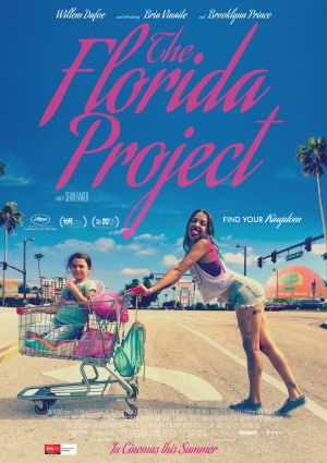
Baker first used Aguafina script in his 2017 family drama “Florida Project,” about a poor mother and daughter living in a motel. It’s also in evidence in his “Red Rocket” and “Tangerine” movies.
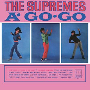
Here and there, branding using graphics or text exists in entertainment. For instance, the early Motown Records record albums followed a similar template of assembling large blocks in solid bright colors for its album jackets in its earliest days. Buyers of Motown vinyl records clearly recognized the brand across multiple artists that is characterized by melodic, up-tempo rhythm-and-blues.
And sometimes movies try to brand colors, such as the yellow hue signature employed by 2006 artbuster hit “Little Miss Sunshine.”
Consumers exposed to the film’s marketing can’t help but think of “Little Miss Sunshine” whenever being awash in yellow.
A New York Times article two months ago by Manuel Betancourt notes that marketing materials for the arty films of celebrated Spanish filmmaker Pedro Almodóvar have signature “ravaging reds, piquant pinks and bruising blues. Posters for his films adorn everything from T-shirts and tote bags to postcards and pins.” The bright style in marketing arcs across his iconic movies from “Women on the Verge of a Nervous Breakdown” to “Tie Me Up! Tie Me Down!”
Leave a Reply