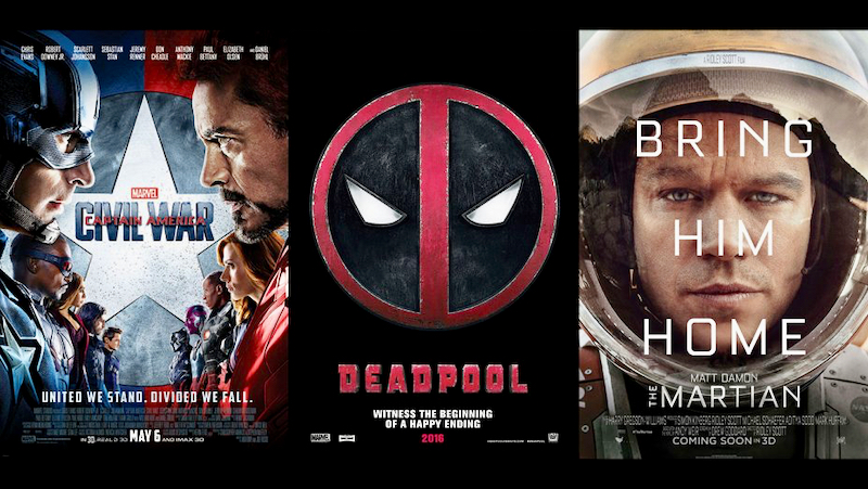
A well-illustrated Hollywood Reporter article laments repetitive key art for movies revolving around one of three themes: The big face (think of Matt Damon’s mug in “The Martin” with text “Bring Him Home”); the big logo/key art; or the faceoff where opposing characters line up nose-to-nose.
“There’s comfort in familiarity,” says the article by Tatiana Siegel. “That’s why the typical movie poster is like a cup of Starbucks coffee: soothingly predictable.”
The article holds out the “Birth of a Nation” poster as different. The poster for the period drama slave revolt from Fox Searchlight has lots of small human images accented by red ink, which projects running blood. However, its stylized logo in 18th century type is prominent, so it’s a semi-“big logo” approach. With its emphasis on small size graphic elements, “Birth of a Nation” does break with the norm of singularly large and bold imaging in movie posters.
While there are complaints about sameness, the industry standard of big imaging in posters does stand out in cluttered media environments like subways and outdoor billboards. It’s argued the consumers don’t take the time to absorb intricate designs with small elements, given consumers are bombarded with advertising messages.
The third edition of book “Marketing To Moviegoers” notes Hollywood film marketers have a longstanding practice of derivative creative messaging whether key-art in posters or movie trailers. Many movies follow similar plots so why not the advertising?
“In creating trailers, no one is shy about being derivative,” says “Marketing To Moviegoers.”†”A trailer that reminds moviegoers of hit films from the past is considered effective in selling the new film, and a new trailer may imitate the style of an old trailer.”
Related content:
Leave a Reply